Archive of the Digital Present for Online Literary Performance in Canada (COVID-19 Pandemic Period) is a research and development project that arises out of the need to address foundational, practical and theoretical research questions about the impact of the recent (and ongoing) COVID-19 pandemic, and attendant social disruptions and restrictions, upon literary communities in Canada through the study of organised literary events as they have occurred online since March 2020.
The papers that constitute this panel focus on the design and development work pursued in building a searchable, open access database and directory – The Archive of the Digital Present (ADP) – to allow scholars, literary practitioners, and the public to gain knowledge about the nature and significance of literary events (online, hybrid, and in-person) that have occurred during the pandemic period, through the collection and structuring of metadata, and, in some cases, with direction to audiovisual (AV) documentation of the events themselves as they were held using platforms such as Zoom and YouTube.
Our papers explain key facets of development by presenting approaches to (1) data collection and structuring, (2) stack development, (3) data visualisation, and (4) front end design, that have emerged through the process of community and user-oriented design research and development used to create the ADP.
Finding and Structuring Metadata about Pandemic Literary Events (Jason Camlot)
Public readings represent a significant form of literary communication, dissemination, circulation and community-building. The study of literary performances, events and activities through audiovisual media documentation, digital images (posters) and textual records, raises important new questions about literary work as it acts in situ among artists and audiences (Camlot, Fong and Shearer). Such materials and the events they document reveal unique traces of sociality and affective response in literary exchange, foreground tonal and performative aspects of cultural transmission, document formations of literary community in action, and highlight the mediated nature of such events as they first occurred and as we subsequently access them through archived recordings. Focusing on the presentation of digital documentation and records of online events of the COVID-19 pandemic period, the ADP is designed to help us understand the impact of pandemic disruptions on literary communities in Canada.
The ADP project necessarily began with questions about the data we were seeking to collect. In February 2021 we performed a preliminary analysis of online and social media postings for listings of literary events hosted in Canada. This revealed 77 discrete organisers of over one thousand (1,011, to be exact) literary events between 20 March 2020 - 31 December 2020. This list served as the starting point for an expanded catalogue of events, and for team discussions about the nature and number of metadata fields we would use. We proceeded by adapting extant categories of the SpokenWeb metadata schema that has been designed for the description of historical literary audio recordings. This allowed us to repurpose the backend of the Swallow Metadata Ingest System ( Swallow), built for metadata management of historical research collections, through the development of a crosswalk that best serves the goals of data collection for ADP. Storing the metadata as unstructured JSON, Swallow makes it possible to quickly generate and modify a cataloguing interface, and changes in metadata schemas, and this flexibility has proven useful for the iterative design and feedback process we have pursued in ADP UX development. Data fields we have shaped for this project include categories related to Title, Creator/Contributor, Language, Production Context, Genre, Duration, Date, Location, Online Platform, and Contents, among others.
This section of our presentation presents our ongoing methods of discovering events to be included in the ADP database, explains the rationale of our selection of metadata categories and our approach to structuring those fields, and raises some of the philosophical and ontological questions that have arisen in the process of abstracting the complex and mediated literary activities of the pandemic period into categories of searchable data. Our methods of data collection extended beyond the analysis of social media notices of events to the identification and research of key organisations involved in hosting events, and to crowdsourcing calls within diverse literary communities. Our selection of the specific fields identified were based on feedback from researchers and practitioners about the kinds of information they would seek from a database such as this, and on our goals in data visualisation, discussed below. Philosophical and ontological questions raised by our data determination and collection process included questions about the nature of an event, the roles of participants in relation to categories such as creator and contributor, and generic categories that include or preclude the overarching category of the “literary” event, and the status of such events as entities within a data structure.
Stack Development and the Rationale of a Headless CMS (Ben Joseph, Francisco Berrizbeitia)
In this section we present the software stack chosen to develop the solution and the rationale behind it. The right technical stack is, to a great extent, the key to a project’s success, while the wrong choice of web application development technologies may be a reason for failure. Our stack had to manage the trade-offs for processing heavy loads and maintaining a low latency with high responsiveness.
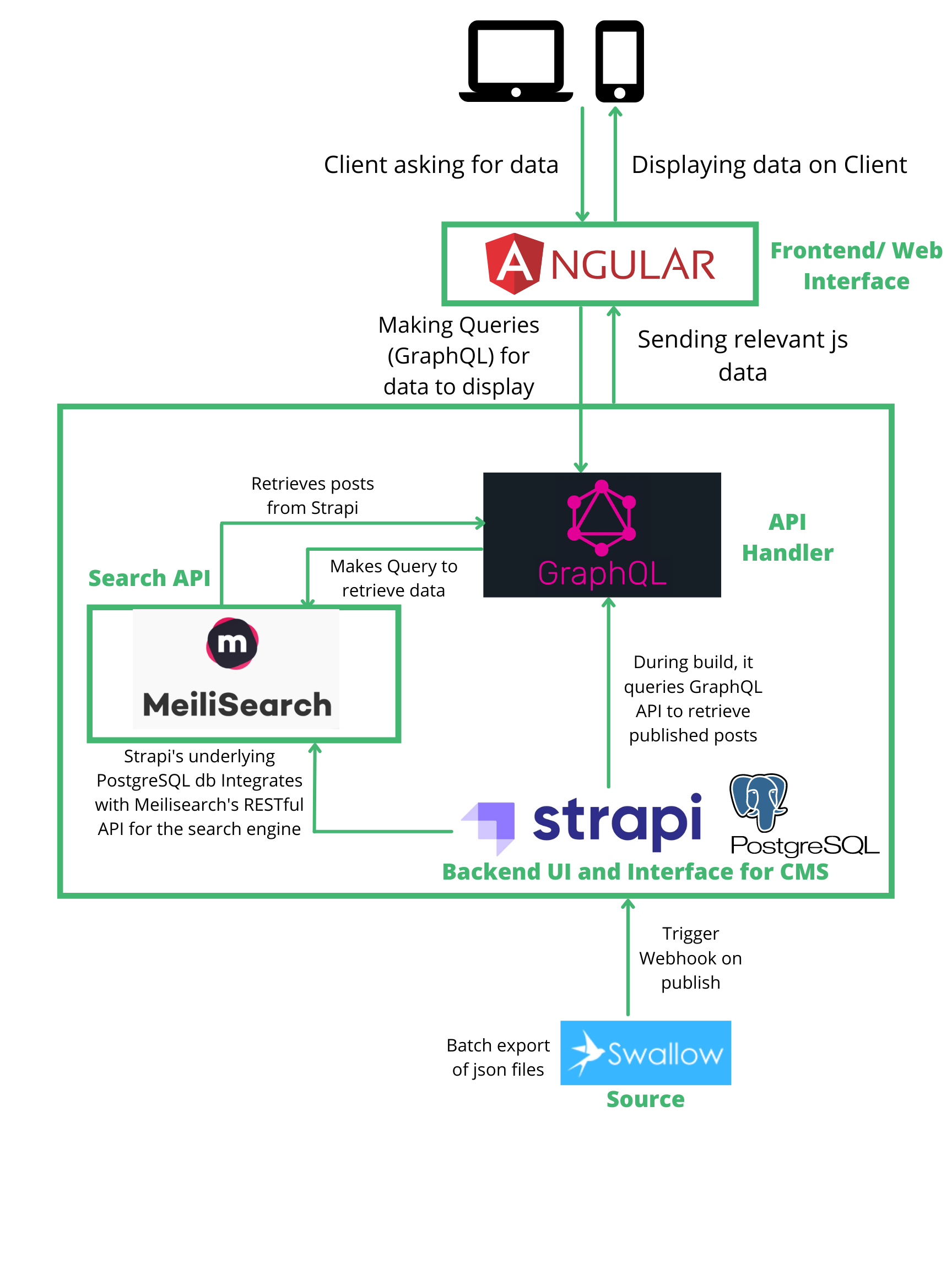
The data was collected using Swallow (Camlot et al. 2020), an open-source metadata management system developed by the SpokenWeb partnership. Interacting with this backend system, cataloguers collected and compiled the information of the different events. This corpus of data is then exported as whole and ingested by the Strapi headless content management system ( https://strapi.io/) as shown in Figure 1. MeiliSearch (https://www.meilisearch.com) provides advanced search functionalities and Strapi allows for digital asset management while providing a backend to the presentation layer. The presentation layer was developed using AngularJS ( https://angularjs.org/). The component-based structure of Angular makes specific sections of code highly reusable across our application and for future frontend developments. The AngularJS layer interacts with the data sources via a GraphQL (https://graphql.org/) thus ensuring data consistency.

Figure 1 . Software stack schema and information flow.
Visualizing Time, Place and Relations of Literary Activity in a Pandemic (Tomasz Neugebauer, Sukesh Gandham)
A user survey identified the host location of the event as one of the more important elements of event description, along with event type, contributors, links to recordings, and the titles of texts read. The most important metadata elements for navigation of content were identified as: names of participants, names of organizers and event, titles of texts read/performed/discussed, and date/time of event. This lead to an initial front page design for the ADP site that included three visualizations of the data: A) Timeline: a spiral histogram (Condegram) showing the number of events that took place on specific dates during the pandemic period B) Connections: a network graph showing adjacency relations between contributors and events, using hierarchical edge bundling based on the events’ organizations, and C) Places: geographical map showing number of events that took place in each of the events’ host cities. These visualizations touched on all the important metadata elements identified in the user surveys, except for the titles of texts read/performed.
During the user-centered design process, a usability session evaluating some proposed wireframes for the site with scholars from the Spokenweb network, event organizers, practitioners and students confirmed that there is interest and enthusiasm for the data visualizations on the interface, especially for any interactive functionalities of these. To keep the visualizations interactive, we decided to treat them as tools that navigate into the data. For example, clicking on a name of a contributor or event in the edge bundling visualization leads the user to the browse view of the search results in the dataset for that name. Similarly, clicking on a bar for a specific date on the condegram, or the city name on the map visualization, leads the user to the browse view of events that took place on that date or that were hosted in that city.
For the implementation of these visualizations, keeping complexity in check, we wanted the same code base for all three of them. We also wanted a solution that is based on open-source code that is free from license restrictions on usage and sharing, which eliminated solutions such as amCharts ( https://www.amcharts.com/). We chose the D3.js ( https://d3js.org/) JavaScript library as our code base to generate Scalable Vector Graphics (SVG) that we present with custom HTML5 and Cascading Style Sheets (CSS). We added the Bootstrap library ( https://getbootstrap.com/docs/3.4/) for responsive functionality. The D3 Gallery ( https://observablehq.com/@d3/gallery) served as an excellent starting place for choosing the closest existing examples to build on. We used Python to transform the ADP JSON data from our Swallow Metadata Management System into data shapes that are required for the three visualizations using D3.
User-Oriented Design and Aesthetics for a Pandemic-Period Website (Alexandre Bustamante)
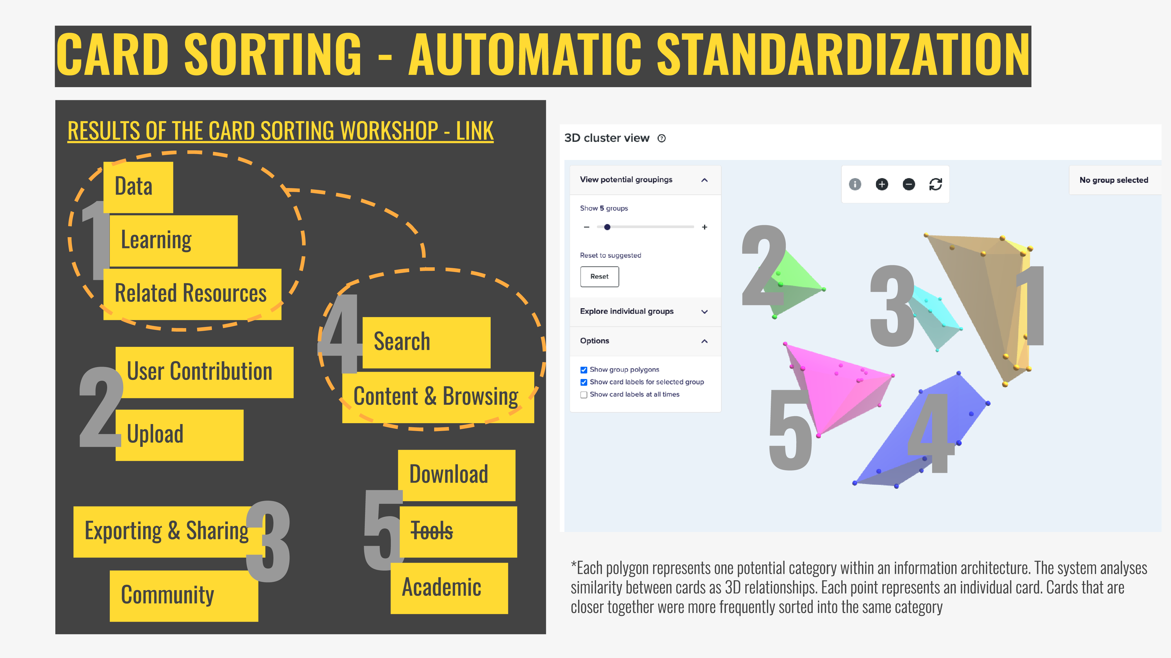
The avenue for building the front-end of ADP was, from an early phase, directed as a user-centred project. After the design was initiated, discussions evolved for experimenting with the lines of a Participatory Design (PD) approach. A user-centred methodology is considered executed "on behalf of users" while PD approaches design "with the users" (Spinuzzi 2005, 165), We chose this option to have ensure greater involvement of the stakeholders of the ADP in all development phases of the front-end design. We organized a series of workshops, PD activities and user-experience research surveys distributed to invited participants and the direct team of the front-end development, with the project designer playing a facilitating rather than individual authorial role. The workshops adopted established design methods (Martin 2012) such as personas and user journeys for delineating stakeholder needs. Card sorting, tree-testing and first-click tests were used to create and confirm an informational architecture (figure 2). We adapted to the added challenge of conducting workshops remotely due to the pandemic. This led to the exploration of available tools, such as Miro Boards ( https://miro.com), Google Jamboards ( https://jamboard.google.com/) and Optimal Workshop ( https://www.optimalworkshop.com).

Figure 2 - Results from an online workshop, with automated interpretation of a card sorting exercise compiled by the user-experience tool Optimal Workshop . Screenshot by the authors.
The initial outcome of the PD process was the creation of a three-level information architecture for the prototype of the front-end design: starting at the first level with an overall glimpse at the directory of events on the home page which presents content through visualizations and browsing functions. From the homepage, the user moves to a second level where content is presented on either a dashboard or in the form of lists in pre-established categories, displaying more information and details and introducing different filters for the content. Finally, the third and final level of the information architecture is detailed access to the metadata, which can be visualized, exported or shared. The front-end design allows a search function to be performed at all three levels, for direct access to the directory of events.

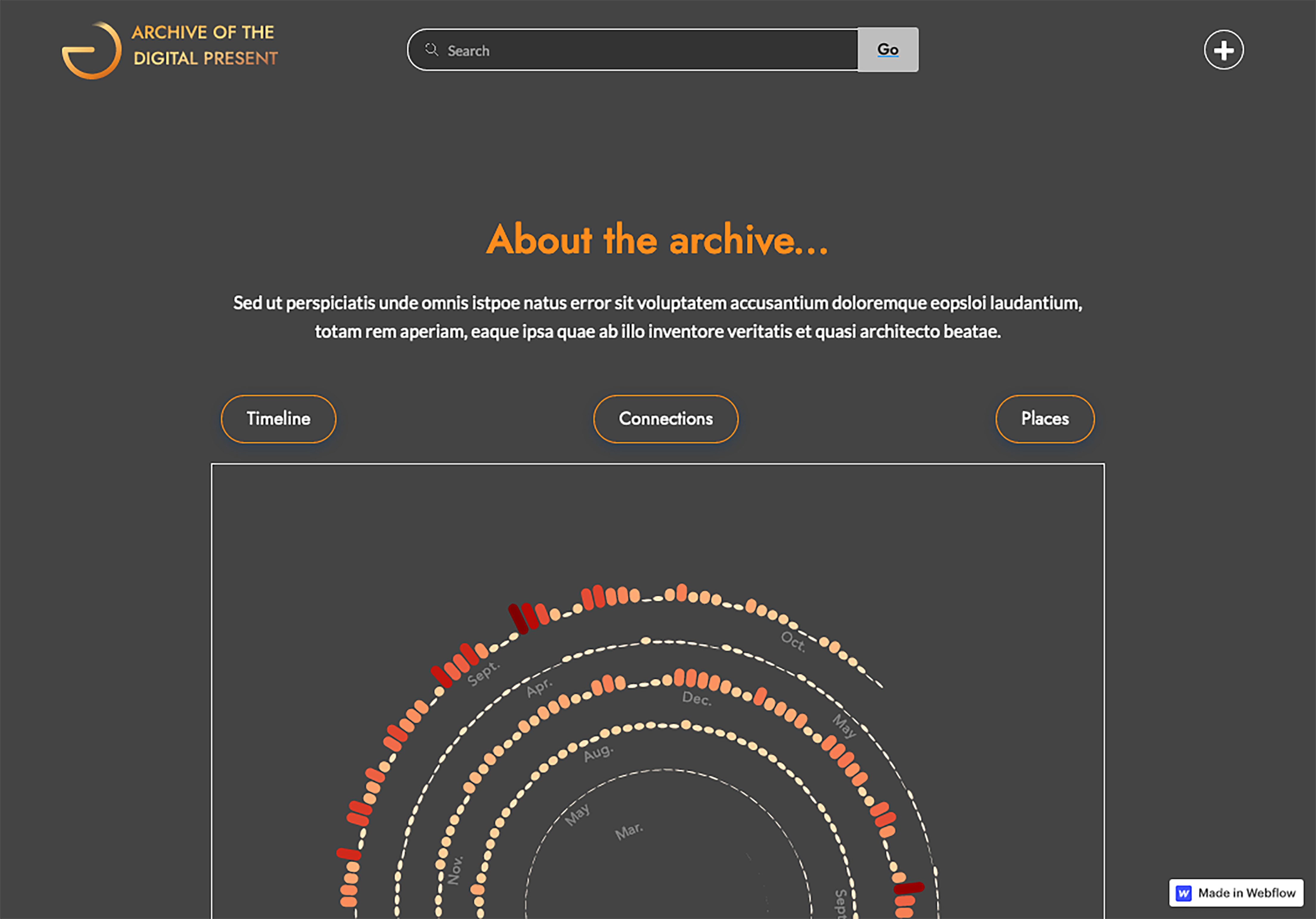
Figure 3 - Latest front-end design for the ADP website. A glimpse of the landing page of the Archive. Screenshot by the authors.
Once the information architecture was established, the participatory approach to design was expanded to inform the final look of the prototype (figure 3). Team members and stakeholders were invited to guide the visual design by reflecting on their perception of the pandemic and providing keywords that capture the experience of living through this period. The final prototype was then designed to reflect on these shared perceptions, drawing from participant’s contributions to inspire a mood board for the design work, which directed the design decisions to achieve a final result that aims to be characteristic of its particular time.